A Specimen by William Caslon
Table of Contents
A piece of typographic history recreated. #
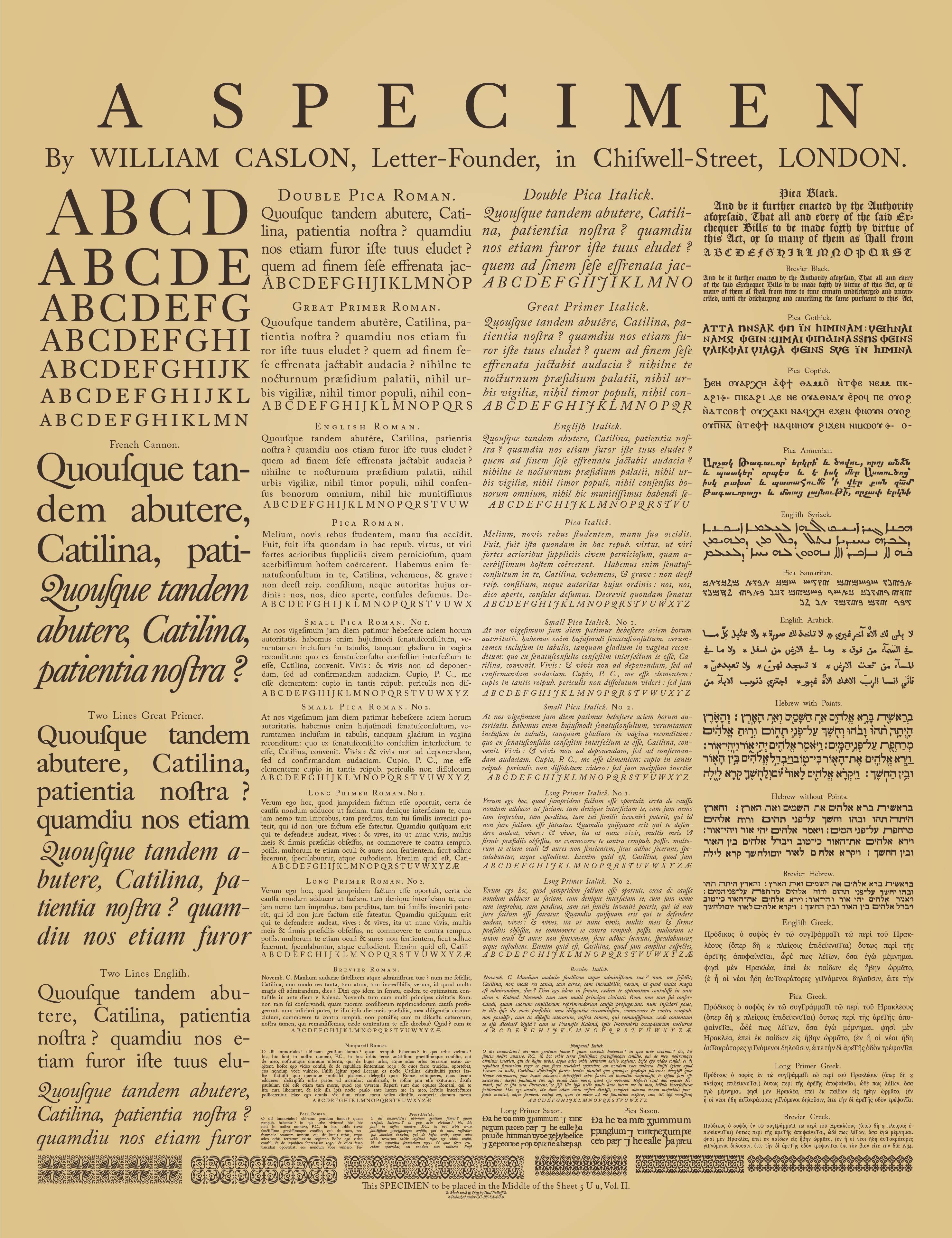
A while ago, I saw the famous specimen sheet that William Caslon distributed in 1734 on the subreddit for typography. I thought it would make a very decent and highly decorative poster. It has a magical appeal to me. However, the resolution of the source file is too low for serious printing. And there is also the problem with optical distortion from the digitization process, as well as stains and inconsistent contrast.
Therefore, I made it my little side project to recreate the specimen sheet in Adobe Illustrator for high quality printing.
You can find the PDF version at the bottom of this post.
Some history #
William Caslon I (1692 – 1766) reached the pinnacle of his creation when he published his specimen sheet in 1734 to advertise his foundry. It is a well-documented historic artefact that Talbot Baines Reed (1887) described as follows:
The sheet is arranged in four columns, and displays 38 fonts:
- Titling: 5-line Pica, 4-line Pica, 2-line Great Primer, 2-line English, 2-line Pica, 2-line Long Primer, 2-line Brevier.
- Roman and Italic: French Canon, 2-line Great Primer, 2-line English, Double Pica, Great Primer, English, Pica, Small Pica (2), Long Primer (2), Brevier, Nonpareil, and Pearl.
- Black: Pica and Brevier.
- Saxon: Pica and Long Primer.
- Gothic, Coptic, Armenian, Samaritan: Pica of each.
- Syriac and Arabic: English of each.
- Hebrew: English, English with points, Brevier.
- Greek: English, Pica, Long Primer, Brevier.
- Ornaments: Seven designs.
Of these, all, with three exceptions, are Caslon’s own handiwork, and represent the untiring industry of fourteen years. Of the excellence of the performance it is sufficient to say that the Specimen placed Caslon absolutely without rival at the head of his profession; ‘and,’ as Nichols says, ‘for clearness and uniformity, for the use of the reader and student, it is doubtful whether it has been exceeded by any subsequent production.’
The three founts referred to as not the product of Caslon’s hand, were the Canon Roman, from Andrews’ foundry, […]; the English Syriac, which is from the matrices of the Polyglot; and the Pica Samaritan, which was cut by a Dutchman named Dummers.
Fame appears to have followed rapidly on the appearance of this Specimen. The sheet was included as an inset plate in the second edition of Ephraim Chambers’ Cyclopædia in 1738, with the following flattering notice: “The above were all cast in the foundery of Mr. W. Caslon, a person who, though not bred to the art of letter-founding, has, by dint of genius, arrived at an excellency in it unknown hitherto in England, and which even surpasses anything of the kind done in Holland or elsewhere.’
There is one version available on Wikipedia, which comes at an acceptable resolution. Archive.org hosts a digitization of three copies of the very same specimen sheet at a very high resolution and at an acceptable quality.
William Caslon II (1720 – 1778) learned from his father and continued the business. Three years before the elder’s death, they published a specimen book in 1763, which got reprinted several times over the course of more than three decades. The son and grandson expanded on the existing work and created more cuts and sizes of the grandfather’s fonts.
In 1785 William Caslon III (1754 – 1833) published a specimen book that features the complete family of Caslon fonts. This specimen book is available on archive.org and can be downloaded in a decent resolution.
Getting Started #
I wanted to stay as close to the original specimen as possible. So, I kept the original proportions and layout. I kept all the original spelling mistakes and only ‘fixed’ the grid, which suffered from the paper being physically folded, and the camera distortion (apparently the specimen sheets were digitized using a Canon 5D).
The first step was to determine the size of the actual sheet. The Double Pica Roman served as scale reference for 24 pt. I defined the 24 pt as my zero point and this step converted the specimen poster into a modern typographic scale (typographic units were not widely standardized at that time yet). This gave me a total size for the sheet of 500 mm x 651 mm. I worked from there to get all other font sizes.
Choosing the ‘right’ Caslon #
There are dozens of Caslon versions available. Over 100 fonts are listed on myfonts.com by using the search term ‘Caslon’. Which would be the best one to choose for this sheet? For simplicity’s sake, let’s have a look at three of the more common Caslon’s available: Adobe Caslon Pro, William Text Pro (Typotheque), and King’s Caslon (Dalton Maag).
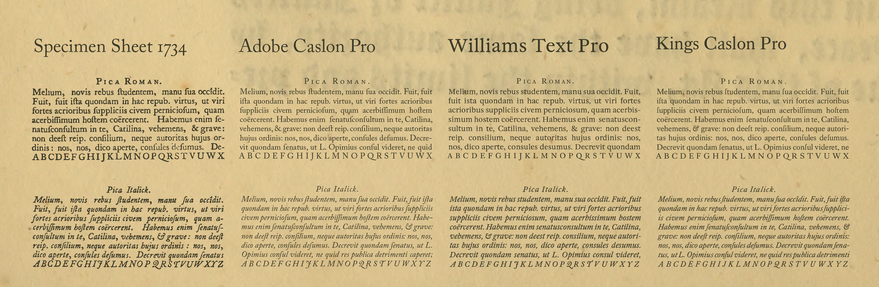
Adobe Caslon has the highest contrast and looks quite thin compared to the other versions. However, it also features a very complete set of historical letters, swashes, ligatures and ornaments. Especially the long s (ſ) with all important ligatures such as ſt and ſi. Also, the overall rhythm appears to be very close to the original specimen.
Williams Text has much lower contrast and has a very good readability on smaller font sizes. This also resembles the original specimen very closely. However, shall be noted here that 18th century printing technology made it quite difficult to create slim letters. Typotheque’s typeface also features a large variety of the most beautiful swashes and ornaments. Unfortunately, the historical long s is missing.
Regarding contrast, Kings Caslon appears to be in between Adobe’s and William’s release. Dalton Maag’s interpretation of Caslon features the historic long s, however without the suitable ligatures. It has only one version of the ampersand (&) and lacks swashes.
For most paragraphs I used Adobe’s version, as it had all historic glyphs that I needed. However, I believe that for modern applications, the other two editions of Caslon are better choices.
Paragraphs #
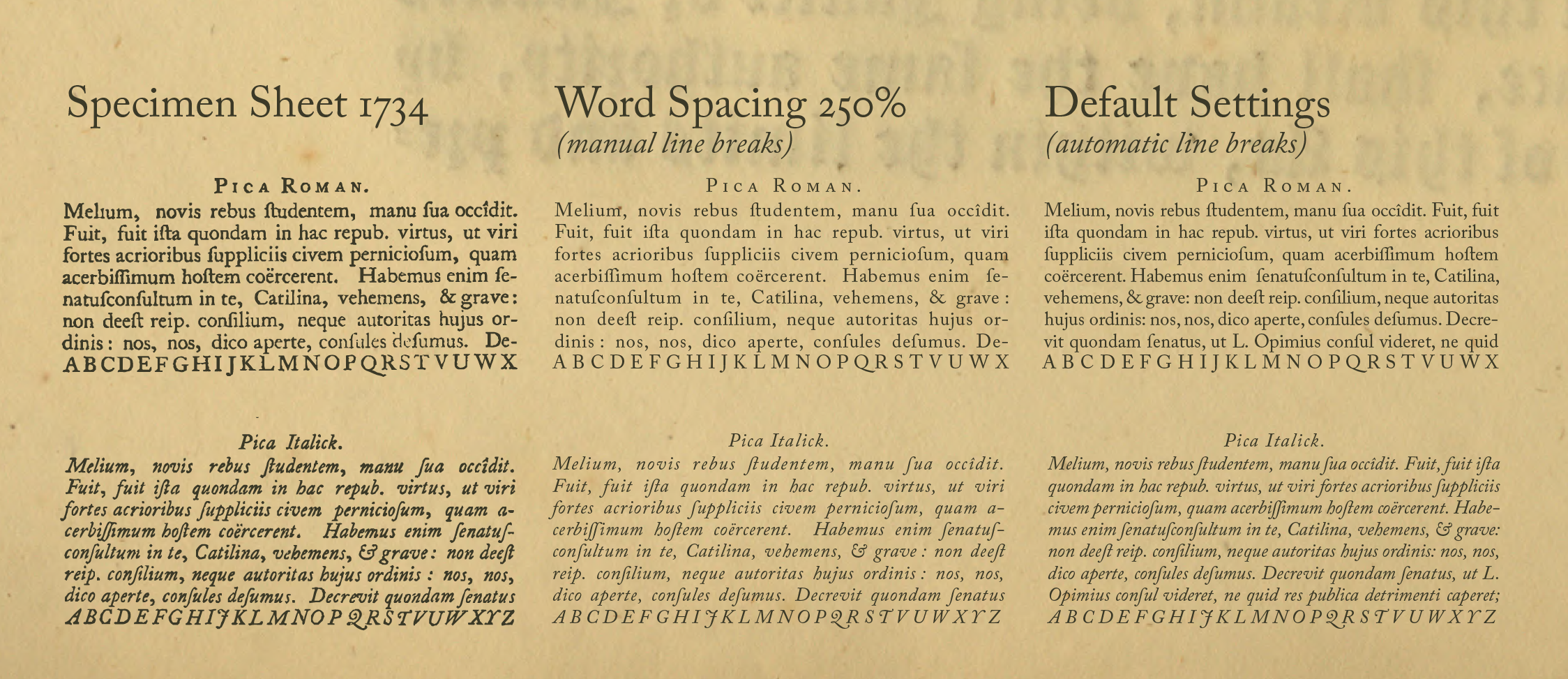
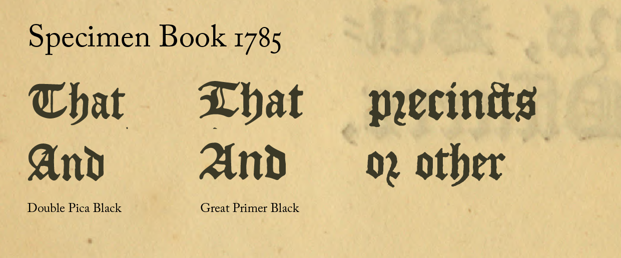
Throughout recreating the paragraphs in the centre, I learned a few things about typesetting in the 18th century. First, the word spacing is much wider compared to modern typesetting. But at the same time the letter spacing (tracking) is denser. Secondly, many words are hyphenated at odd places, sometimes even right after the first letter. Illustrator’s line composer on the other hand, avoids hyphenation as much as possible.
Blackletter #
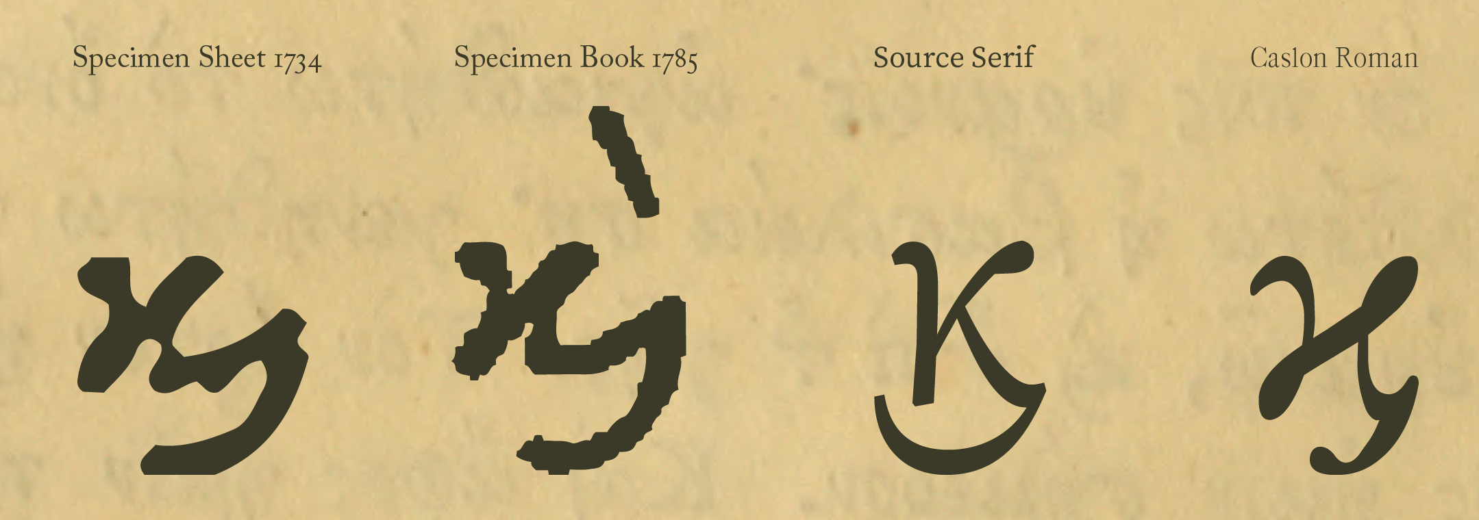
There are only a few blackletter fonts available that are directly based on Caslon’s specimen. The three fonts that I found were: DS Cloister Black, Caslon Gotisch Normal, and CaslonishFraxx. DS Cloister Black is based on a later revival of the original typeface. An interpretation of an interpretation, so to say.
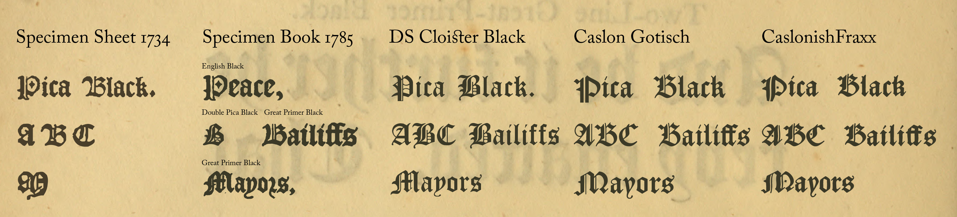
The black-letter specimen from the sheet has some different details compared to the specimen book. The capital letters change depending on the font size, where the ones from the larger sizes have a more ornamental character compared to the smaller ones. It is also highly noticeable, that the capital P among others have a distinct decorative element that is not present in any modern interpretation.
I decided to use Caslon Gotisch Normal and borrowed some glyphs from DS Cloister Black.
One challenge presented the r rotunda (ꝛ), which is not present in any of the pre-made fonts. I ended up making the ꝛ as a custom glyph by vectorizing it from the specimen book (1785).
Non-Latin scripts #
The non-Latin scripts required some creative and arbitrary solutions. I am still not perfectly satisfied with the results yet. I just simply vectorized the specimens of the following scripts: Gothic, Armenian, Syriac, Samaritan, Arabic, and Hebrew. I used the full specimen book from 1785 as additional source, because the distortion is not as strong compared to the specimen sheet. Most of them were exactly the same paragraphs. Some of them I had to truncate the lines and rearrange the vectorized glyphs.
Arabic #
William Caslon was already known as a young talented letter-cutter in the year 1720. But his career as a letter founder took off after he delivered an Arabic fount for the Society for Promoting Christian Knowledge. The purpose was to print the New Testament and Psalter for Christians in the Middle-East. Apparently, printing was prohibited in that region at that time, so therefore the job was done in England (Reed, 1887). When Caslon finished the specimen for his Arabic fount, he placed his name in pica roman (12pt) at the bottom. The letters were so well cut that his patron advised him to complete the pica roman.
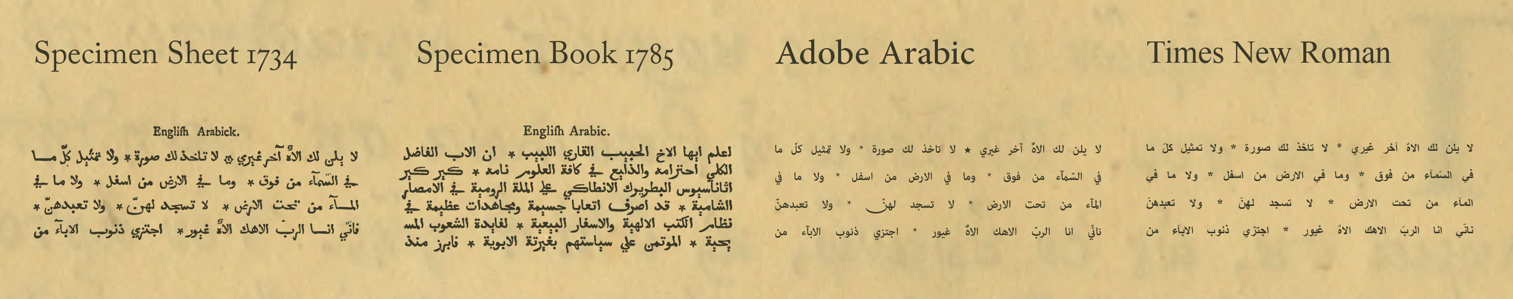
I am no expert at Arabic at all. But from what I have found out, I would say that Caslon’s Arabic is hardly present in modern fonts. I couldn’t find any modern Arabic font that is based on Caslon. Therefore, I cleaned the image as much as I could and vectorized it.
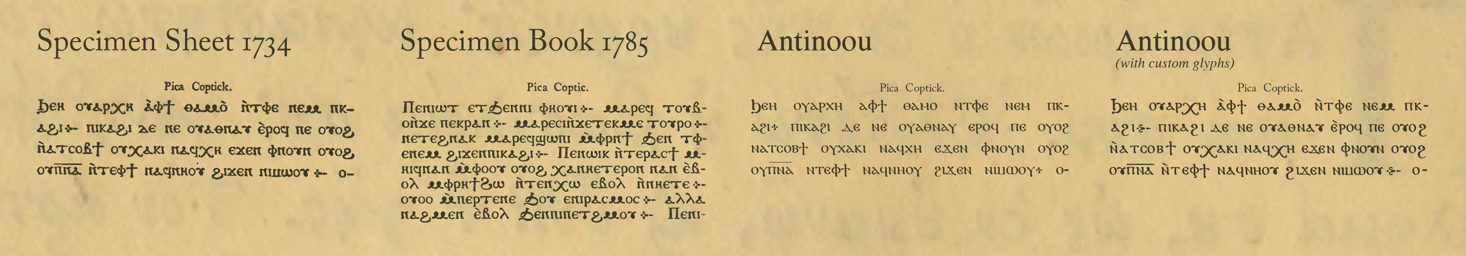
Coptic #
After Caslon finished his Arabic, he created one Hebrew. His reputation for making good non-Latin types got him a constant flow of requests. Doctor David Wilkins, was Keeper of the Lambeth Library under Archbishop Wake, ordered a cut of Coptic script. Similar to Arabic, the Coptic script was created for religious texts.
I crawled the world wide web for finding a suitable Coptic font that somehow resembles Caslon’s. And I discovered Antinoou. I had to manually alter some of the glyphs, but I am overall quite satisfied with the result. I used a similar ‘technique’ for the Saxon text as well, however based on William Text Pro.
Greek #
I am not so happy with the Greek paragraphs. Caslon’s Greek script is a hybrid of roman and italic. It is hard to find a font that comes close to this style. There is one font called Caslon Unicode, however it is from the pre-2000s, which makes it pre-historic. Therefore, I opted to use William Text Pro that also has complete Greek support. I scaled the glyphs horizontally by 90% to give them the same slim look as the original ones have. I know that this is not very optimal, but I think it looks better than simply vectorizing the specimen.
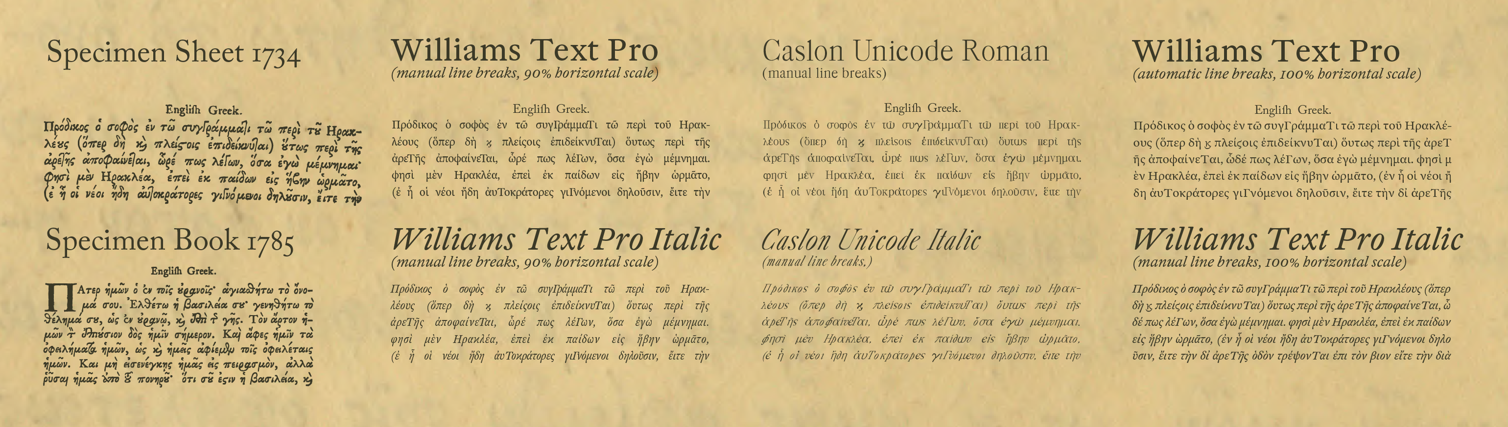
One curiosity is the ancient Greek equivalent of an ampersand: kai – ϗ̀. There is hardly a font that features this glyph. Unexpectedly, Caslon Unicode Roman does. And it also comes close to Caslon’s kai.
Conclusion & Download #
I just picked a few items that I found particularly interesting in recreating this specimen sheet. Of course there are dozens of other details that would deserve another analysis. There is quite a good selection of readings available regarding Caslon and his typefaces. I collected some articles below.
References #
- Reed, Talbot Baines (1887). A history of the old English letter foundries. With notes, historical and bibliographical, on the rise and progress of English typography. London, E. Stock. [Gutenberg](http://www.gutenberg.org/ebooks/54365
- Caslon, William (1734). A Specimen. Letter-founder in Chiswell Street, London. [Wikipedia](https://commons.wikimedia.org/wiki/File:A_Specimen_by_William_Caslon.jpg [Archive.org](https://archive.org/details/McGillLibrary-rbsc_caslon-william-speciman-colgate3-C377C377S51734-17593
- Caslon, William III (1785). A Specimen of Printing Types. Letter-founder to His Majesty. London. Printed by Galabin and Baker. Archive.org
- The Gentle Author (April 18, 2018). At The Caslon Foundry In Chiswell St. Spitalfields Life (blog). spitalfieldslife.com
- Berkson, William (July 26, 2010). Reviving Caslon. Part 1: The snare of authenticity. I Love Typography (blog). ilovetypography.com
- Berkson, William (November 2, 2010). Reviving Caslon. Part 2: Readability, affability, authority. I Love Typography (blog). ilovetypography.com